Imagery, graphics and icons
Tips on the Fight for Sight photographic style and the icons we use to communicate.

Our photographic style
Ideally our imagery should look natural and capture authentic life interactions and expressions between people caught in a moment. Embracing our value of 'together' can be a good guide when looking for suitable imagery.
A people-first approach
People are at the heart of everything we do, whether we're capturing researchers in a lab, someone with lived experience, or people taking part in our social change programmes.
We are 'people-first'.
- Always express positivity.
- Support the message in a relevant and engaging way.
- Capture a moment in time.
- Avoid cliché situations or overly-contrived shots.
- Use natural lighting whenever possible. Use space and ensure the subjects are the focus of the image. Try to avoid overly busy or cluttered images and consider space to place text or characters within a layout.
With people at the heart of everything we do, it’s important that we represent and celebrate diversity through the images we use. We should ensure that our photography includes a wide range of ethnic, gender, ability, age, and cultural representation.
When commissioning photographers for new imagery, include in the brief the potential use of some of the images with the aperture effect, so that the photographer is mindful of the composition.
Please always ensure that the people in the images have consented to being photographed and filled in a form for Fight for Sight to use the images.
See some examples below:

Researcher at work
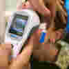
Funded researcher, Jasmina Kapetanovic.
Jasmina is looking through an ophthalmic device. Behind her is an eye chart.

Family Funds
Image (left) shows the Cameron Family sitting together on a sofa.
The Cameron Family Fund is fundraising for pioneering research into autosomal dominant optic atrophy (ADOA) to help children Edward and Beth - and others who have been diagnosed with the condition.

Artist at work
Paula Long’s paintings are a bold celebration of colour, from shimmering sunsets over poppy fields to tactile depictions of trees, yellow leaves embellished with gold flecks or multicoloured boughs dotted by bright beads.
Paula, 61, is pictured here doing a painting in her well-lit living room.
She was diagnosed with glaucoma in 2008.
Aperture effect
The symbol within our logo can be used as a shape/aperture to hold imagery. We should only feature this at a hero level across our communications – i.e., front covers, banners, social media posts, etc. – rather than on internal spreads within a report.
When selecting imagery to use within the aperture, think carefully about how it will appear once cropped within the shape. Try to use imagery where the focal point of the image is at the centre of the shot – this will help to keep the important part of the image clear and visible when cropped into the shape.
The aperture should always be placed against a simple solid background—either white or one of our brand colours—never against another photographic image. Select a colour background that provides a good contrast to the image used—this will ensure that the shape of the symbol is clearly visible.
Please see some examples of the aperture below.
Farm life
The image (right) shows an image of a young person visiting 'Jamie's Farm'.
A chicken is balancing on their shoulder.
It is framed within the aperture that mirrors our logo and is set against the navy blue background.


Marathon effort
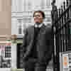
Tommy Salisbury from the Salisbury Family Fund.
Tommy wears a grey tracksuit and jogs through London's streets to prepare for the London Marathon, which he has since successfully completed.
He is framed within the aperture, which is placed on a turquoise background.

Icons
We have a small selection of icons we can use on our website or within printed materials.
They're designed using navy and dark purple and have a distinctive 'gap', which is a design element that continues through all of them.
Please see the collection of icons below.
Please right-click on the file to download it.
Calendar icon
Artistic representation of a month within a calendar in navy and dark purple.
Eye icon
A navy and blue eye. The icon is struck through to imply 'no' and so represents vision loss.
Eye chart icon
An icon representing an eye chart as used by optometrists and ophthalmologists.
Letters are larger at the top than at the bottom.
Location icon
An icon as seen on a map to represent location or 'you are here'.
Magnifying glass icon
A simple icon of a magnifying glass, which is presented in brand colours of dark navy and dark purple.
Person icon
An icon that represents a person, specifically the head and shoulders. It is stylised as are our other brand icons.
-
People-first
-
Aperture
-
Icons
- People-first
- Aperture
- Icons

